

Combining Multiple Plots
Introduction
Data visualization helps us understand data patterns, trends, and relationships easily.A dashboard combines different types of charts in one place to provide a complete view of data. In this notebook, we create three different plots:
- Line Plot - Used to show trends over time.
- Bar Plot - Used to compare values between categories.
- Heatmap - Used to display relationships between variables.
Libraries Used
- Pandas: Used for data handling and analysis.
- NumPy: Used for generating numerical data.
- Matplotlib: Used for creating basic visualizations.
- Seaborn: Used for advanced statistical plots.
1. Line Plot - Monthly Sales Trend
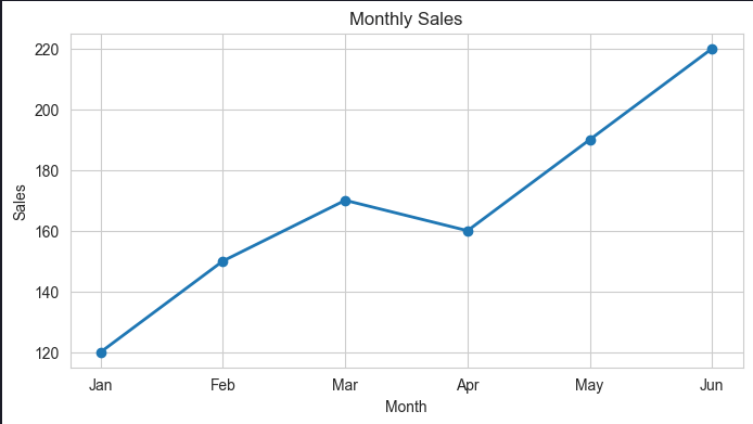
A line plot represents data points connected by lines.It is mainly used to understand changes and trends over time.
Objective:
To visualize monthly sales performance from January to June.Code:
Observation:
- Sales show an overall increasing trend.
- A small decrease can be seen in April.
- The highest sales are recorded in June.
Uses of Line Plot:
- Tracking sales trends.
- Monitoring growth over time.
- Analyzing time-series data.
2. Bar Plot - Revenue by Category
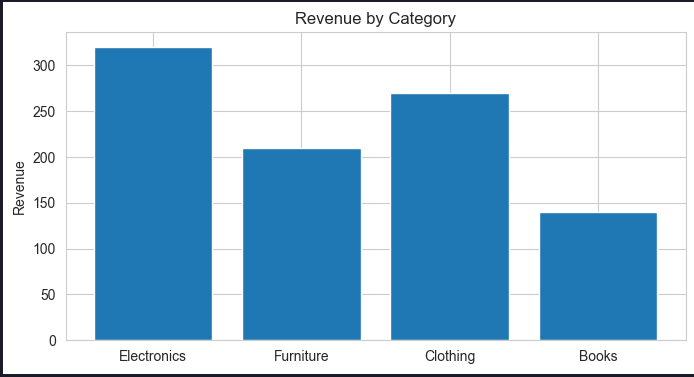
A bar plot represents data using rectangular bars.It is useful for comparing values among different categories.
Objective:
To compare revenue generated by different product categories.Code:
Observation:
- Electronics generates the highest revenue.
- Furniture and Clothing have moderate revenue.
- Books generate the lowest revenue.
Uses of Bar Plot:
- Comparing categories.
- Analyzing product performance.
- Displaying survey or business data.
3. Heatmap - Correlation Analysis
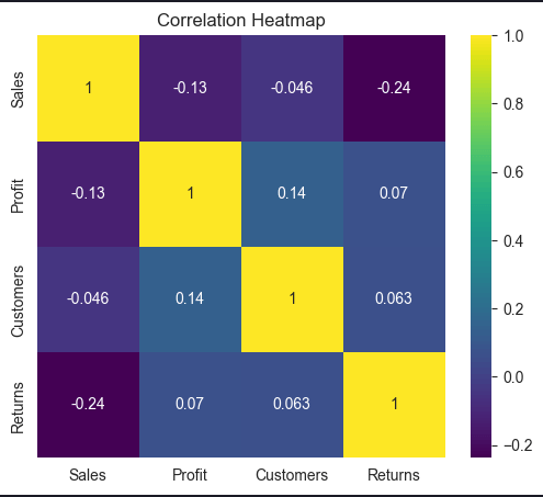
A heatmap displays data values using different colors.It helps identify relationships between numerical variables.
Objective:
To find correlations between Sales, Profit, Customers, and Returns.Creating Dataset:
Code:
Observation:
- Heatmap shows the relationship between different variables.
- Values close to 1 indicate positive correlation.
- Values close to -1 indicate negative correlation.
- Helps identify important patterns in data.
Uses of Heatmap:
- Correlation analysis.
- Finding relationships between variables.
- Understanding complex datasets.
Combining Plots into a Dashboard
A dashboard combines multiple visualizations to provide meaningful insights. The three plots created in this notebook provide different views:Conclusion
Combining multiple plots in a single notebook helps analyze data from different perspectives.- Line plots help understand trends.
- Bar plots help compare categories.
- Heatmaps help analyze relationships.