

Introduction to Matplotlib
What is Data Visualization?
Data Visualization is the process of converting raw data into charts, graphs, and plots to:- Understand patterns
- Detect trends
- Find outliers
- Analyze relationships
What is Matplotlib?
Matplotlib is a Python library used for creating:- Line charts
- Histograms
- Boxplots
- Pie charts
- Scatter plots
- Bar charts
- 3D plots
- Data Science
- Machine Learning
- Analytics
Installing Matplotlib
Installation
Importing Libraries
Explanation
matplotlib.pyplot→ plotting functionspandas→ data handling
Basic Plot Function
plt.plot()
Creates a line plot.
Output
A line graph connecting points:- (1,4)
- (2,5)
- (3,6)
Explanation
plot()→ creates line graphgrid()→ adds background gridshow()→ displays graph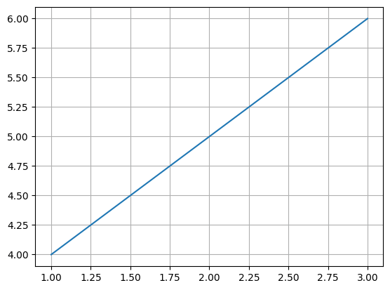
Components of a Figure
Univariate Analysis
Analyzing one variable.Line Plot
Shows trends or changes in numerical data.Explanation
color='red'→ line colormarker='o'→ circle markerslinestyle=':'→ dotted linelinewidth=2→ line thickness
Output
Salary trend line graph.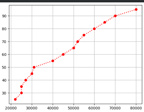
Histogram
plt.hist()
Shows frequency distribution.
Explanation
bins=5→ divides data into 5 ranges- Shows how many values fall into each range
Output
Bar-like histogram distribution.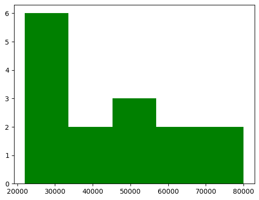
Box Plot
plt.boxplot()
Used for:
- detecting outliers
- understanding spread
- quartile analysis
Output
Boxplot showing median and quartiles.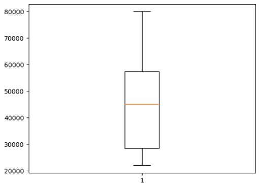
Outlier Detection
Explanation
Adding0 creates an outlier visible in boxplot.
Categorical Analysis
Pie Chart
Shows percentage contribution.Explanation
labels→ category namesautopct→ percentage displayexplode→ separates sliceaxis('equal')→ perfect circle
Output
Department percentage pie chart.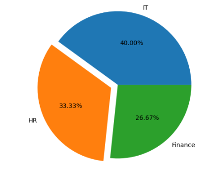
Count Plot / Bar Chart
plt.bar()
Shows category frequencies.
Output
Bar chart of department counts.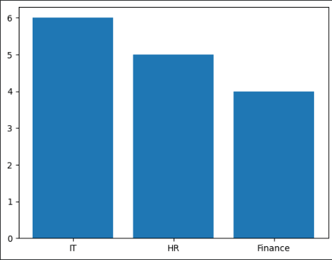
Bivariate Analysis
Analyzing relationship between two variables.Scatter Plot
plt.scatter()
Shows relationship between two numerical variables.
Explanation
Each dot represents:- X → Salary
- Y → Age
Output
Scatter plot showing salary vs age.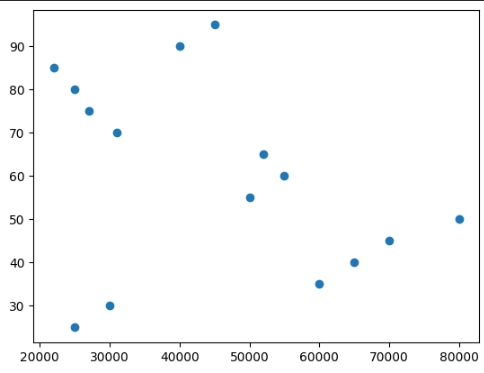
Sorted Line Plot
Explanation
Sorting improves line continuity.Bar Chart
Explanation
Compares salary for each age.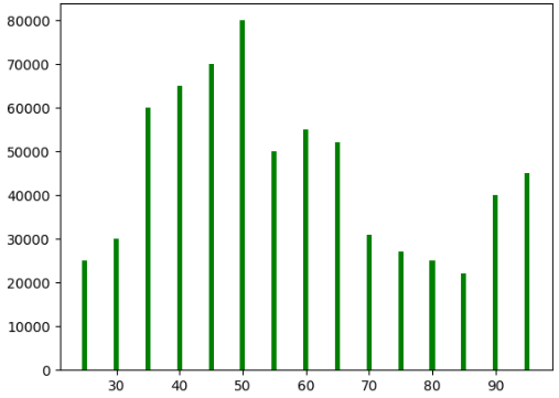
Numerical vs Categorical Analysis
Multiple Boxplots
Explanation
Compares salary distributions across departments.Output
Three side-by-side boxplots.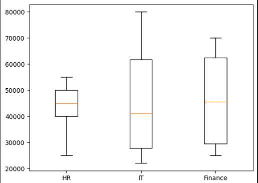
Department Salary Pie Chart
Explanation
Shows total salary contribution by department.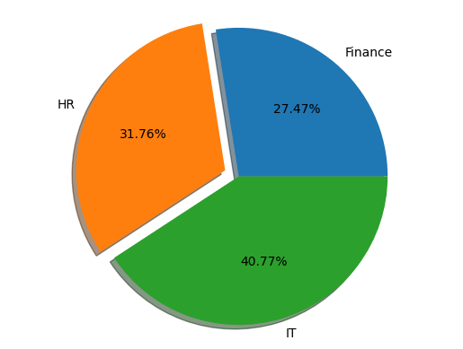
Mean Salary Bar Chart
Explanation
Displays average salary per department.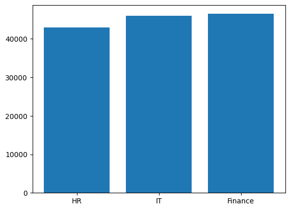
Multivariate Analysis
Analyzing 3 or more variables.Bubble Plot
Explanation
- X → Salary
- Y → Age
- Bubble Size → Experience
Output
Bubble plot with varying circle sizes.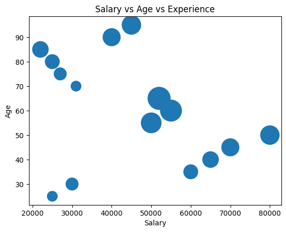
Color-Based Scatter Plot
Explanation
Different colors represent departments.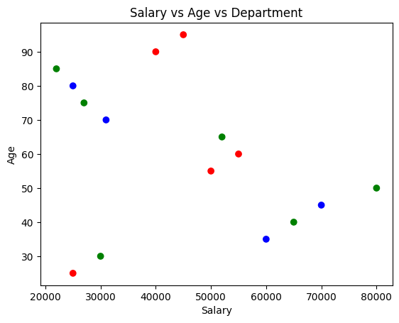
Scatter Plot with Legend
Explanation
Adds department-wise legend.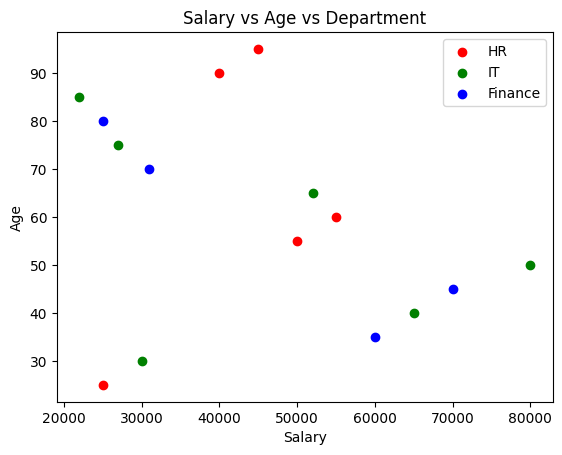
Object Oriented API
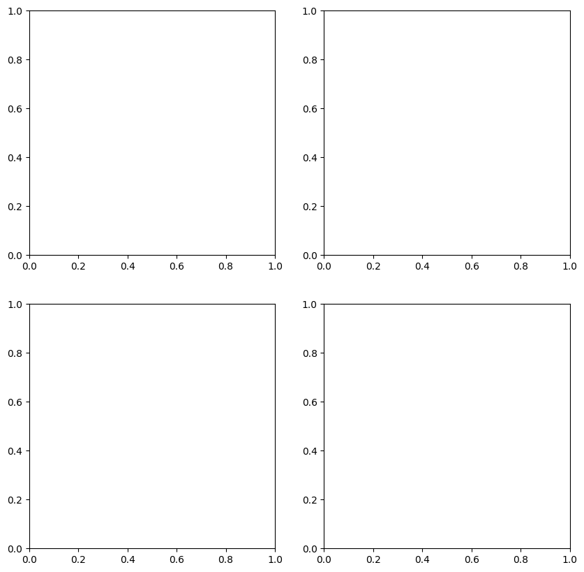
Provides more control over plots.plt.subplots()
Creates multiple plots.
Explanation
- 2 rows
- 2 columns
- Figure size = 10x10
Multiple Plots
Line Plot
Histogram
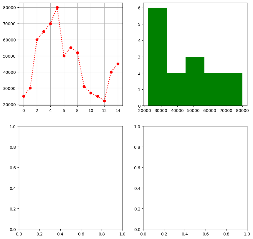
Boxplot
Saving Figures
savefig()
Saves plot locally.
Explanation
Saves graph as PNG image.Multiple Line Plots
Explanation
Displays multiple lines in same graph.Output
Sales, Profit, and Expenses comparison graph.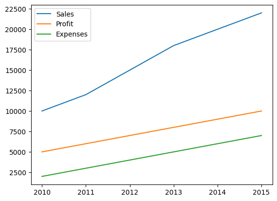
3D Plot
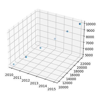
Explanation
Creates 3D scatter plot. Axes:- X → Year
- Y → Sales
- Z → Profit
Plotly 3D Plot
Explanation
Interactive 3D visualization using Plotly.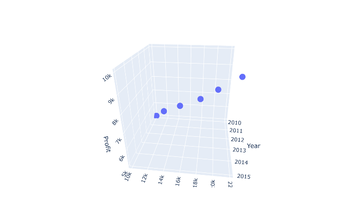
Important Plot Types Summary
Important Matplotlib Functions
Matplotlib Usage
Matplotlib helps to:- Visualize datasets
- Understand trends
- Detect outliers
- Compare categories
- Analyze relationships
- Create professional graphs