> ## Documentation Index
> Fetch the complete documentation index at: https://ai.tharung.in/llms.txt
> Use this file to discover all available pages before exploring further.
# Seaborn
# Seaborn Complete Notes
# What is Seaborn?
Seaborn is a Python data visualization library built on top of Matplotlib.
It helps to:
* Create beautiful statistical plots
* Reduce plotting code
* Improve plot styling automatically
* Visualize complex datasets easily
Used in:
* Data Science
* Machine Learning
* Data Analysis
***
# Installing Seaborn
## Installation
```bash theme={null}
pip install seaborn
```
***
# Importing Libraries
```python theme={null}
import seaborn as sns
import pandas as pd
import numpy as np
```
### Explanation
* `sns` → seaborn alias
* `pd` → pandas
* `np` → numpy
***
# Loading Dataset in Seaborn
# `sns.get_dataset_names()`
Shows available built-in datasets.
```python theme={null}
sns.get_dataset_names()
```
### Output
List of datasets like:
```python theme={null}
['penguins', 'tips', 'iris', 'diamonds', ...]
```
***
# `sns.load_dataset()`
Loads built-in dataset.
```python theme={null}
penguins = sns.load_dataset('penguins')
penguins.head()
```
### Output
```python theme={null}
species island bill_length_mm ...
```
### Explanation
Loads penguins dataset into DataFrame.
***
# `value_counts()`
Counts category occurrences.
```python theme={null}
penguins['species'].value_counts()
```
### Output
```python theme={null}
Adelie 152
Gentoo 124
Chinstrap 68
```
### Explanation
Counts penguins species frequency.
***
# Scatter Plot
# `sns.scatterplot()`
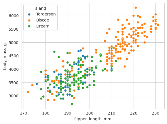
Used to visualize relationship between two numerical variables.
```python theme={null}
sns.scatterplot(
data=penguins,
x='flipper_length_mm',
y='body_mass_g',
hue='island'
)
```
### Explanation
* `x` → x-axis variable
* `y` → y-axis variable
* `hue` → color grouping
### Output
Scatter plot grouped by island colors.
 ***
# Styling in Seaborn
# `sns.set_style()`
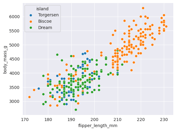
Changes plot background style.
```python theme={null}
sns.set_style('whitegrid')
```
### Available Styles
* white
* dark
* whitegrid
* darkgrid
* ticks
***
# `sns.despine()`
Removes plot borders/spines.
```python theme={null}
sns.despine(left=True)
```
### Explanation
Removes left spine.
***
# Styling in Seaborn
# `sns.set_style()`
Changes plot background style.
```python theme={null}
sns.set_style('whitegrid')
```
### Available Styles
* white
* dark
* whitegrid
* darkgrid
* ticks
***
# `sns.despine()`
Removes plot borders/spines.
```python theme={null}
sns.despine(left=True)
```
### Explanation
Removes left spine.
 ***
# `sns.set_context()`
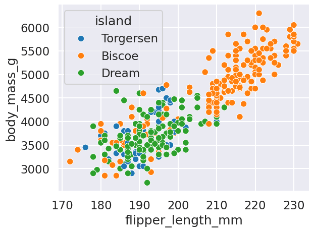
Controls scaling of plot elements.
```python theme={null}
sns.set_context('talk')
```
***
# `sns.set_context()`
Controls scaling of plot elements.
```python theme={null}
sns.set_context('talk')
```
 ### Context Types
| Context | Usage |
| :------- | :------------- |
| paper | Small plots |
| notebook | Default |
| talk | Presentation |
| poster | Large displays |
***
# Palette
# `palette`
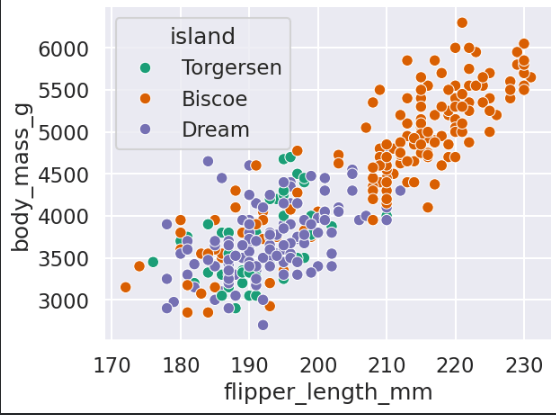
Controls color theme.
```python theme={null}
sns.scatterplot(
data=penguins,
x='flipper_length_mm',
y='body_mass_g',
hue='island',
palette='Dark2'
)
```
### Explanation
Uses Dark2 color palette.
### Context Types
| Context | Usage |
| :------- | :------------- |
| paper | Small plots |
| notebook | Default |
| talk | Presentation |
| poster | Large displays |
***
# Palette
# `palette`
Controls color theme.
```python theme={null}
sns.scatterplot(
data=penguins,
x='flipper_length_mm',
y='body_mass_g',
hue='island',
palette='Dark2'
)
```
### Explanation
Uses Dark2 color palette.
 ***
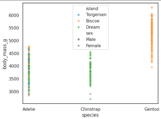
# Scatter Plot with Style and Alpha
```python theme={null}
sns.scatterplot(
data=penguins,
x='species',
y='body_mass_g',
hue='island',
style='sex',
alpha=0.5
)
```
### Explanation
* `style` → marker style changes
* `alpha` → transparency
***
# Scatter Plot with Style and Alpha
```python theme={null}
sns.scatterplot(
data=penguins,
x='species',
y='body_mass_g',
hue='island',
style='sex',
alpha=0.5
)
```
### Explanation
* `style` → marker style changes
* `alpha` → transparency
 ***
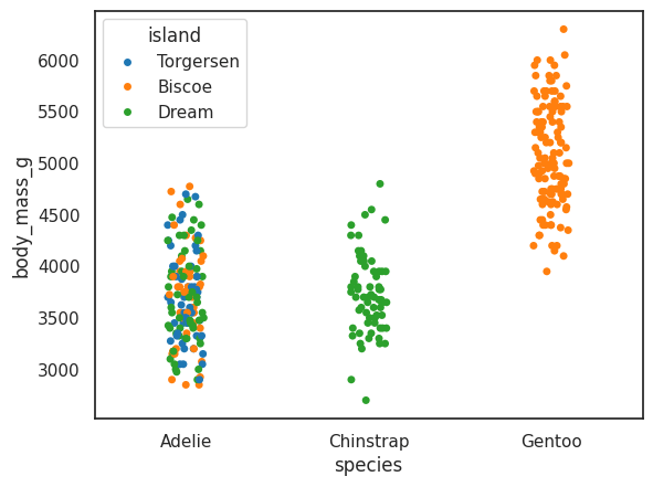
# Strip Plot
# `sns.stripplot()`
Shows distribution of categorical data.
```python theme={null}
sns.stripplot(
data=penguins,
x='species',
y='body_mass_g',
hue='island'
)
```
### Output
Categorical scatter-like plot.
***
# Strip Plot
# `sns.stripplot()`
Shows distribution of categorical data.
```python theme={null}
sns.stripplot(
data=penguins,
x='species',
y='body_mass_g',
hue='island'
)
```
### Output
Categorical scatter-like plot.
 ***
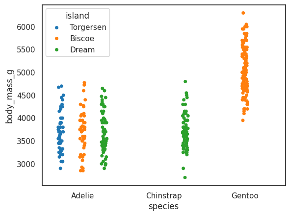
# `dodge=True`
Separates hue categories.
```python theme={null}
sns.stripplot(
data=penguins,
x='species',
y='body_mass_g',
hue='island',
dodge=True
)
```
***
# `dodge=True`
Separates hue categories.
```python theme={null}
sns.stripplot(
data=penguins,
x='species',
y='body_mass_g',
hue='island',
dodge=True
)
```
 ***
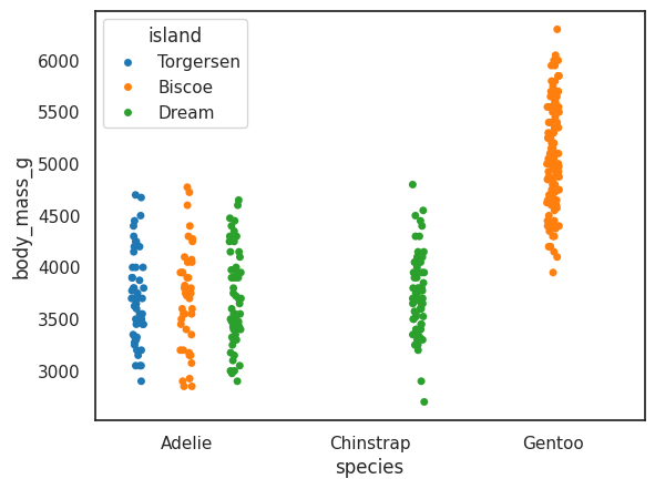
# `jitter=True`
Adds random spacing.
```python theme={null}
sns.stripplot(
data=penguins,
x='species',
y='body_mass_g',
hue='island',
dodge=True,
jitter=True
)
```
### Explanation
Avoids overlapping points.
***
# `jitter=True`
Adds random spacing.
```python theme={null}
sns.stripplot(
data=penguins,
x='species',
y='body_mass_g',
hue='island',
dodge=True,
jitter=True
)
```
### Explanation
Avoids overlapping points.
 ***
# Swarm Plot
# `sns.swarmplot()`
Automatically prevents overlap.
```python theme={null}
sns.swarmplot(
data=penguins,
x='species',
y='body_mass_g',
hue='island'
)
```
### Output
Bee swarm arrangement of points.
***
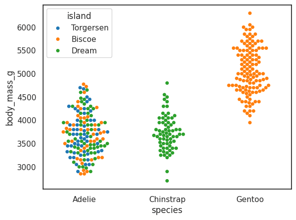
# Swarm Plot
# `sns.swarmplot()`
Automatically prevents overlap.
```python theme={null}
sns.swarmplot(
data=penguins,
x='species',
y='body_mass_g',
hue='island'
)
```
### Output
Bee swarm arrangement of points.
 ***
# Histogram
# `sns.histplot()`
Shows data distribution.
```python theme={null}
sns.histplot(
data=penguins,
x='body_mass_g',
hue='sex',
multiple='stack'
)
```
### Explanation
* `multiple='stack'` → stacked histogram
***
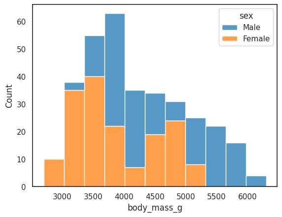
# Histogram
# `sns.histplot()`
Shows data distribution.
```python theme={null}
sns.histplot(
data=penguins,
x='body_mass_g',
hue='sex',
multiple='stack'
)
```
### Explanation
* `multiple='stack'` → stacked histogram
 ***
# Regression Plot
# `sns.regplot()`
Adds regression trend line.
```python theme={null}
sns.regplot(
data=penguins,
x='body_mass_g',
y='flipper_length_mm',
color='green'
)
```
### Explanation
Shows linear relationship between variables.
***
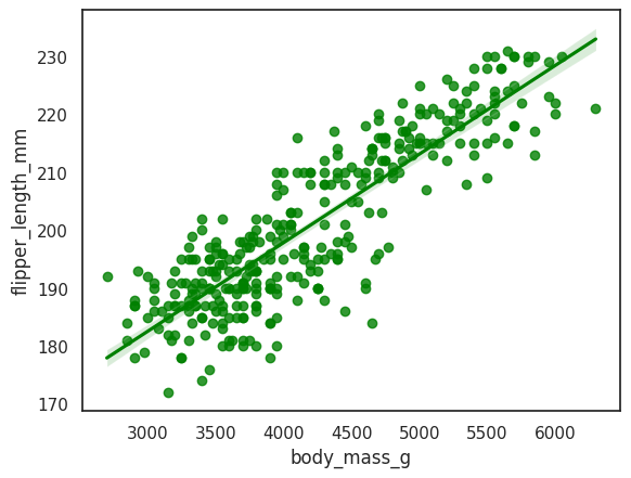
# Regression Plot
# `sns.regplot()`
Adds regression trend line.
```python theme={null}
sns.regplot(
data=penguins,
x='body_mass_g',
y='flipper_length_mm',
color='green'
)
```
### Explanation
Shows linear relationship between variables.
 ***
# Line Plot
# `sns.lineplot()`
Shows continuous trends.
```python theme={null}
sns.lineplot(
data=penguins,
x='body_mass_g',
y='flipper_length_mm',
hue='island',
style='sex'
)
```
### Explanation
* Different colors → islands
* Different styles → sex
***
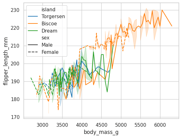
# Line Plot
# `sns.lineplot()`
Shows continuous trends.
```python theme={null}
sns.lineplot(
data=penguins,
x='body_mass_g',
y='flipper_length_mm',
hue='island',
style='sex'
)
```
### Explanation
* Different colors → islands
* Different styles → sex
 ***
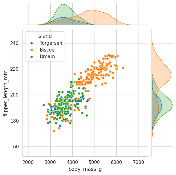
# Joint Plot
# `sns.jointplot()`
Combines scatter plot + distributions.
```python theme={null}
sns.jointplot(
data=penguins,
x='body_mass_g',
y='flipper_length_mm',
kind='scatter'
)
```
### Output
Central scatter plot with side histograms.
***
# Joint Plot
# `sns.jointplot()`
Combines scatter plot + distributions.
```python theme={null}
sns.jointplot(
data=penguins,
x='body_mass_g',
y='flipper_length_mm',
kind='scatter'
)
```
### Output
Central scatter plot with side histograms.
 ***
# KDE Joint Plot
```python theme={null}
sns.jointplot(
data=penguins,
x='body_mass_g',
y='flipper_length_mm',
hue='sex',
kind='kde'
)
```
### Explanation
Uses density estimation instead of scatter points.
***
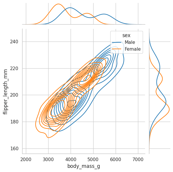
# KDE Joint Plot
```python theme={null}
sns.jointplot(
data=penguins,
x='body_mass_g',
y='flipper_length_mm',
hue='sex',
kind='kde'
)
```
### Explanation
Uses density estimation instead of scatter points.
 ***
# Bar Plot
# `sns.barplot()`
Shows average values by category.
```python theme={null}
sns.barplot(
data=penguins,
x='species',
y='body_mass_g',
hue='sex',
palette=['red','blue']
)
```
### Explanation
Compares mean body mass.
***
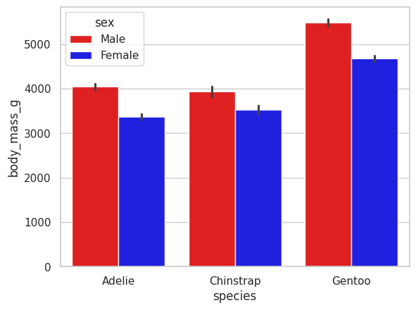
# Bar Plot
# `sns.barplot()`
Shows average values by category.
```python theme={null}
sns.barplot(
data=penguins,
x='species',
y='body_mass_g',
hue='sex',
palette=['red','blue']
)
```
### Explanation
Compares mean body mass.
 ***
# Count Plot
# `sns.countplot()`
Counts categorical occurrences.
```python theme={null}
sns.countplot(
data=penguins,
x='species'
)
```
### Output
Bar chart of species counts.
***
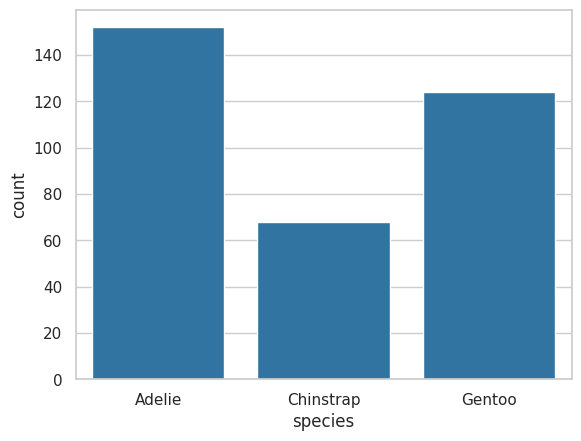
# Count Plot
# `sns.countplot()`
Counts categorical occurrences.
```python theme={null}
sns.countplot(
data=penguins,
x='species'
)
```
### Output
Bar chart of species counts.
 ***
# Box Plot
# `sns.boxplot()`
Shows:
* median
* quartiles
* outliers
```python theme={null}
sns.boxplot(
data=penguins,
x='species',
y='body_mass_g',
hue='sex'
)
```
### Output
Distribution comparison across species.
***
# Box Plot
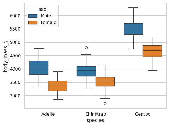
# `sns.boxplot()`
Shows:
* median
* quartiles
* outliers
```python theme={null}
sns.boxplot(
data=penguins,
x='species',
y='body_mass_g',
hue='sex'
)
```
### Output
Distribution comparison across species.
 ***
# Violin Plot
# `sns.violinplot()`
Combines boxplot + density plot.
```python theme={null}
sns.violinplot(
data=penguins,
x='species',
y='body_mass_g',
hue='sex'
)
```
### Explanation
Width shows density of values.
***
# Violin Plot
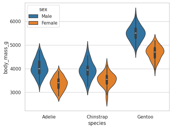
# `sns.violinplot()`
Combines boxplot + density plot.
```python theme={null}
sns.violinplot(
data=penguins,
x='species',
y='body_mass_g',
hue='sex'
)
```
### Explanation
Width shows density of values.
 ***
# Split Violin Plot
```python theme={null}
sns.violinplot(
data=penguins,
x='species',
y='body_mass_g',
hue='sex',
split=True
)
```
### Explanation
Male and female shown in one violin.
***
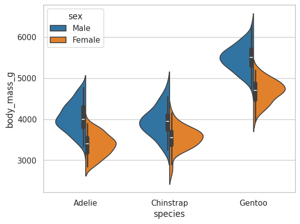
# Split Violin Plot
```python theme={null}
sns.violinplot(
data=penguins,
x='species',
y='body_mass_g',
hue='sex',
split=True
)
```
### Explanation
Male and female shown in one violin.
 ***
# Inner Quartiles
```python theme={null}
sns.violinplot(
data=penguins,
x='species',
y='body_mass_g',
hue='sex',
split=True,
inner='quartile'
)
```
### Explanation
Shows quartile lines inside violin.
***
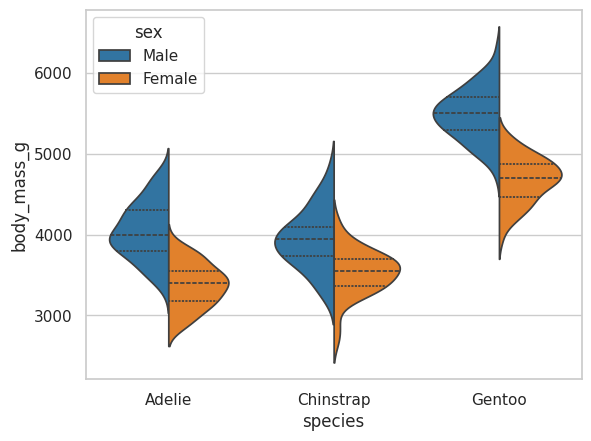
# Inner Quartiles
```python theme={null}
sns.violinplot(
data=penguins,
x='species',
y='body_mass_g',
hue='sex',
split=True,
inner='quartile'
)
```
### Explanation
Shows quartile lines inside violin.
 ***
# Swarm + Violin Combined
```python theme={null}
sns.violinplot(data=penguins,
x='species',
y='body_mass_g')
sns.swarmplot(
data=penguins,
x='species',
y='body_mass_g',
color='black',
size=3
)
```
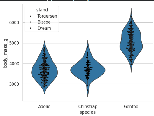
### Explanation
Combines density + individual points.
***
# Swarm + Violin Combined
```python theme={null}
sns.violinplot(data=penguins,
x='species',
y='body_mass_g')
sns.swarmplot(
data=penguins,
x='species',
y='body_mass_g',
color='black',
size=3
)
```
### Explanation
Combines density + individual points.
 ***
# KDE Plot
# `sns.kdeplot()`
Smooth probability density curve.
```python theme={null}
sns.kdeplot(
data=penguins,
x='body_mass_g',
hue='species',
fill=True
)
```
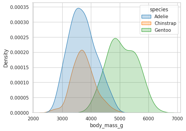
### Explanation
* Smooth histogram alternative
* `fill=True` fills area
***
# KDE Plot
# `sns.kdeplot()`
Smooth probability density curve.
```python theme={null}
sns.kdeplot(
data=penguins,
x='body_mass_g',
hue='species',
fill=True
)
```
### Explanation
* Smooth histogram alternative
* `fill=True` fills area
 ***
# Heatmap
# `sns.heatmap()`
Displays matrix with colors.
```python theme={null}
columns = [
"bill_length_mm",
"bill_depth_mm",
"flipper_length_mm",
"body_mass_g"
]
penguins_corr = penguins[columns].corr()
sns.heatmap(
data=penguins_corr,
annot=True,
vmin=-0.2
)
```
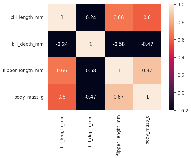
### Explanation
* `corr()` → correlation matrix
* `annot=True` → show values
* `vmin` → minimum color scale
### Output
Correlation heatmap.
***
# Heatmap
# `sns.heatmap()`
Displays matrix with colors.
```python theme={null}
columns = [
"bill_length_mm",
"bill_depth_mm",
"flipper_length_mm",
"body_mass_g"
]
penguins_corr = penguins[columns].corr()
sns.heatmap(
data=penguins_corr,
annot=True,
vmin=-0.2
)
```
### Explanation
* `corr()` → correlation matrix
* `annot=True` → show values
* `vmin` → minimum color scale
### Output
Correlation heatmap.
 ***
# Rug Plot
# `sns.rugplot()`
Shows individual data points as ticks.
```python theme={null}
sns.rugplot(
data=penguins,
x='body_mass_g',
hue='species',
palette='Set2'
)
```
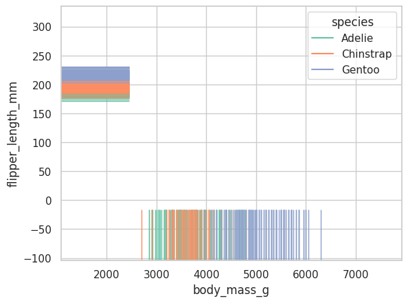
### Output
Small tick marks along axis.
***
# Rug Plot
# `sns.rugplot()`
Shows individual data points as ticks.
```python theme={null}
sns.rugplot(
data=penguins,
x='body_mass_g',
hue='species',
palette='Set2'
)
```
### Output
Small tick marks along axis.
 ***
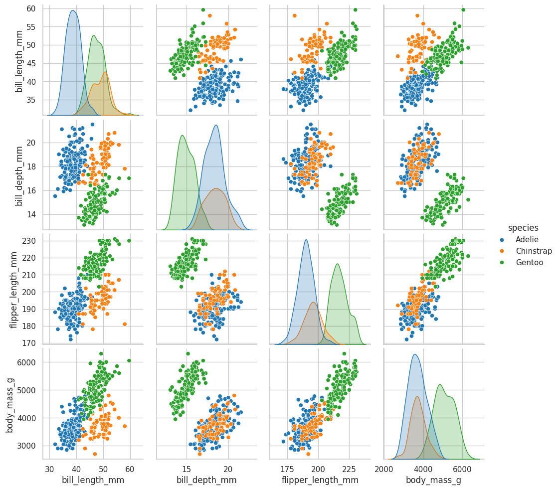
# Pair Plot
# `sns.pairplot()`
Creates pairwise plots automatically.
```python theme={null}
sns.pairplot(
data=penguins,
hue='species'
)
```
### Output
Grid of scatter plots and histograms.
***
# Pair Plot
# `sns.pairplot()`
Creates pairwise plots automatically.
```python theme={null}
sns.pairplot(
data=penguins,
hue='species'
)
```
### Output
Grid of scatter plots and histograms.
 ***
# Pair Plot with Histogram
```python theme={null}
sns.pairplot(
data=penguins,
hue='species',
diag_kind='hist'
)
```
### Explanation
Diagonal uses histograms instead of KDE.
***
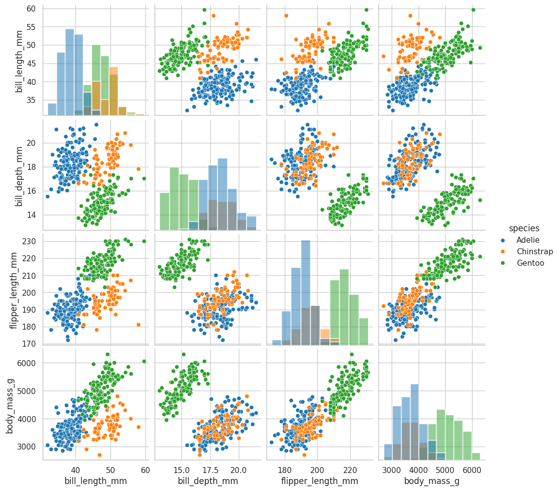
# Pair Plot with Histogram
```python theme={null}
sns.pairplot(
data=penguins,
hue='species',
diag_kind='hist'
)
```
### Explanation
Diagonal uses histograms instead of KDE.
 ***
# Pair Grid
# `sns.PairGrid()`
Custom subplot grid.
```python theme={null}
g = sns.PairGrid(
data=penguins,
hue='sex',
palette='Set2'
)
g.map_upper(sns.scatterplot)
g.map_lower(sns.kdeplot)
g.map_diag(sns.histplot)
g.add_legend()
```
### Explanation
* `map_upper()` → upper triangle plots
* `map_lower()` → lower triangle plots
* `map_diag()` → diagonal plots
### Output
Fully customized pairwise visualization grid.
***
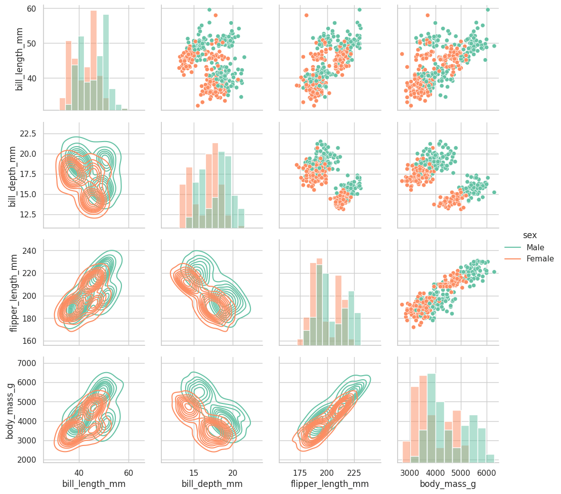
# Pair Grid
# `sns.PairGrid()`
Custom subplot grid.
```python theme={null}
g = sns.PairGrid(
data=penguins,
hue='sex',
palette='Set2'
)
g.map_upper(sns.scatterplot)
g.map_lower(sns.kdeplot)
g.map_diag(sns.histplot)
g.add_legend()
```
### Explanation
* `map_upper()` → upper triangle plots
* `map_lower()` → lower triangle plots
* `map_diag()` → diagonal plots
### Output
Fully customized pairwise visualization grid.
 ***
# Seaborn Plot Summary
| Plot | Purpose |
| :---------- | :----------------------------- |
| scatterplot | Relationship between variables |
| stripplot | Categorical spread |
| swarmplot | Non-overlapping stripplot |
| histplot | Distribution |
| regplot | Regression trend |
| lineplot | Continuous trends |
| jointplot | Combined distributions |
| barplot | Average comparison |
| countplot | Frequency count |
| boxplot | Outlier detection |
| violinplot | Density + boxplot |
| kdeplot | Smooth distribution |
| heatmap | Correlation matrix |
| rugplot | Individual data ticks |
| pairplot | Automatic pair relationships |
| PairGrid | Custom pairwise plots |
***
# Important Seaborn Functions
| Function | Purpose |
| :-------------- | :-------------------- |
| `set_style()` | Plot style |
| `set_context()` | Scaling |
| `despine()` | Remove borders |
| `scatterplot()` | Scatter plot |
| `histplot()` | Histogram |
| `regplot()` | Regression line |
| `lineplot()` | Line graph |
| `barplot()` | Bar chart |
| `countplot()` | Count categories |
| `boxplot()` | Quartiles & outliers |
| `violinplot()` | Density visualization |
| `heatmap()` | Matrix heatmap |
| `pairplot()` | Pairwise analysis |
***
# Seaborn Helps
Seaborn helps to:
* Create attractive statistical plots
* Analyze distributions
* Detect patterns
* Understand correlations
* Visualize categorical and numerical data easily
Advantages:
* Less code
* Better styling
* Easy integration with Pandas
* Built on Matplotlib
***
# Seaborn Plot Summary
| Plot | Purpose |
| :---------- | :----------------------------- |
| scatterplot | Relationship between variables |
| stripplot | Categorical spread |
| swarmplot | Non-overlapping stripplot |
| histplot | Distribution |
| regplot | Regression trend |
| lineplot | Continuous trends |
| jointplot | Combined distributions |
| barplot | Average comparison |
| countplot | Frequency count |
| boxplot | Outlier detection |
| violinplot | Density + boxplot |
| kdeplot | Smooth distribution |
| heatmap | Correlation matrix |
| rugplot | Individual data ticks |
| pairplot | Automatic pair relationships |
| PairGrid | Custom pairwise plots |
***
# Important Seaborn Functions
| Function | Purpose |
| :-------------- | :-------------------- |
| `set_style()` | Plot style |
| `set_context()` | Scaling |
| `despine()` | Remove borders |
| `scatterplot()` | Scatter plot |
| `histplot()` | Histogram |
| `regplot()` | Regression line |
| `lineplot()` | Line graph |
| `barplot()` | Bar chart |
| `countplot()` | Count categories |
| `boxplot()` | Quartiles & outliers |
| `violinplot()` | Density visualization |
| `heatmap()` | Matrix heatmap |
| `pairplot()` | Pairwise analysis |
***
# Seaborn Helps
Seaborn helps to:
* Create attractive statistical plots
* Analyze distributions
* Detect patterns
* Understand correlations
* Visualize categorical and numerical data easily
Advantages:
* Less code
* Better styling
* Easy integration with Pandas
* Built on Matplotlib