> ## Documentation Index
> Fetch the complete documentation index at: https://ai.tharung.in/llms.txt
> Use this file to discover all available pages before exploring further.
# Matplotlib
# Introduction to Matplotlib
## What is Data Visualization?
Data Visualization is the process of converting raw data into charts, graphs, and plots to:
* Understand patterns
* Detect trends
* Find outliers
* Analyze relationships
***
# What is Matplotlib?
Matplotlib is a Python library used for creating:
* Line charts
* Histograms
* Boxplots
* Pie charts
* Scatter plots
* Bar charts
* 3D plots
Widely used in:
* Data Science
* Machine Learning
* Analytics
***
# Installing Matplotlib
## Installation
```bash theme={null}
pip install matplotlib
```
***
# Importing Libraries
```python theme={null}
import matplotlib.pyplot as plt
import pandas as pd
```
### Explanation
* `matplotlib.pyplot` → plotting functions
* `pandas` → data handling
***
# Basic Plot Function
## `plt.plot()`
Creates a line plot.
```python theme={null}
x = [1,2,3]
y = [4,5,6]
plt.plot(x,y)
plt.grid()
plt.show()
```
### Output
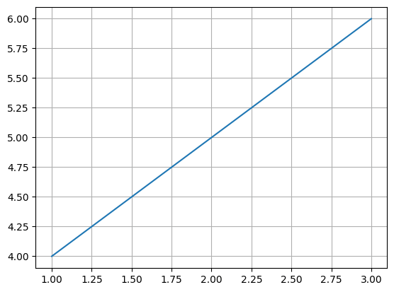
A line graph connecting points:
* (1,4)
* (2,5)
* (3,6)
### Explanation
* `plot()` → creates line graph
* `grid()` → adds background grid
* `show()` → displays graph
 ***
# Components of a Figure
| Component | Purpose |
| :-------- | :-------------------- |
| Figure | Entire canvas |
| Axes | X and Y plotting area |
| Title | Graph heading |
| Labels | Axis descriptions |
| Legend | Explains colors/lines |
| Grid | Improves readability |
| Ticks | Scale markings |
***
# Univariate Analysis
Analyzing one variable.
***
# Line Plot
Shows trends or changes in numerical data.
```python theme={null}
plt.plot(df['Salary'],
color='red',
marker='o',
linestyle=':',
linewidth=2)
plt.grid()
plt.show()
```
### Explanation
* `color='red'` → line color
* `marker='o'` → circle markers
* `linestyle=':'` → dotted line
* `linewidth=2` → line thickness
### Output
Salary trend line graph.
***
# Components of a Figure
| Component | Purpose |
| :-------- | :-------------------- |
| Figure | Entire canvas |
| Axes | X and Y plotting area |
| Title | Graph heading |
| Labels | Axis descriptions |
| Legend | Explains colors/lines |
| Grid | Improves readability |
| Ticks | Scale markings |
***
# Univariate Analysis
Analyzing one variable.
***
# Line Plot
Shows trends or changes in numerical data.
```python theme={null}
plt.plot(df['Salary'],
color='red',
marker='o',
linestyle=':',
linewidth=2)
plt.grid()
plt.show()
```
### Explanation
* `color='red'` → line color
* `marker='o'` → circle markers
* `linestyle=':'` → dotted line
* `linewidth=2` → line thickness
### Output
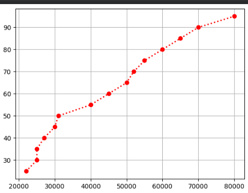
Salary trend line graph.
 ***
# Histogram
## `plt.hist()`
Shows frequency distribution.
```python theme={null}
plt.hist(df['Salary'], bins=5, color='green')
plt.show()
```
### Explanation
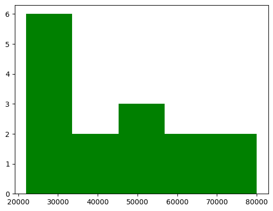
* `bins=5` → divides data into 5 ranges
* Shows how many values fall into each range
### Output
Bar-like histogram distribution.
***
# Histogram
## `plt.hist()`
Shows frequency distribution.
```python theme={null}
plt.hist(df['Salary'], bins=5, color='green')
plt.show()
```
### Explanation
* `bins=5` → divides data into 5 ranges
* Shows how many values fall into each range
### Output
Bar-like histogram distribution.
 ***
# Box Plot
## `plt.boxplot()`
Used for:
* detecting outliers
* understanding spread
* quartile analysis
```python theme={null}
plt.boxplot(df['Salary'])
plt.show()
```
### Output
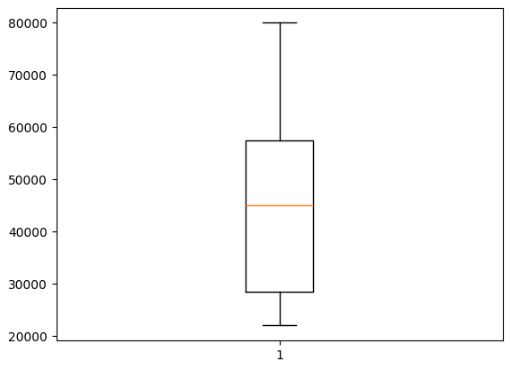
Boxplot showing median and quartiles.
***
# Box Plot
## `plt.boxplot()`
Used for:
* detecting outliers
* understanding spread
* quartile analysis
```python theme={null}
plt.boxplot(df['Salary'])
plt.show()
```
### Output
Boxplot showing median and quartiles.
 ***
# Outlier Detection
```python theme={null}
df.loc[15] = [0]
plt.boxplot(df['Salary'])
plt.show()
```
### Explanation
Adding `0` creates an outlier visible in boxplot.
***
# Categorical Analysis
***
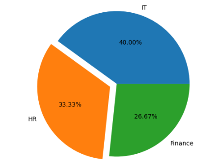
# Pie Chart
Shows percentage contribution.
```python theme={null}
count = df['dept'].value_counts()
plt.pie(count,
labels=count.index,
autopct='%1.2f%%',
explode=[0,0.1,0])
plt.axis('equal')
plt.show()
```
### Explanation
* `labels` → category names
* `autopct` → percentage display
* `explode` → separates slice
* `axis('equal')` → perfect circle
### Output
Department percentage pie chart.
***
# Outlier Detection
```python theme={null}
df.loc[15] = [0]
plt.boxplot(df['Salary'])
plt.show()
```
### Explanation
Adding `0` creates an outlier visible in boxplot.
***
# Categorical Analysis
***
# Pie Chart
Shows percentage contribution.
```python theme={null}
count = df['dept'].value_counts()
plt.pie(count,
labels=count.index,
autopct='%1.2f%%',
explode=[0,0.1,0])
plt.axis('equal')
plt.show()
```
### Explanation
* `labels` → category names
* `autopct` → percentage display
* `explode` → separates slice
* `axis('equal')` → perfect circle
### Output
Department percentage pie chart.
 ***
# Count Plot / Bar Chart
## `plt.bar()`
Shows category frequencies.
```python theme={null}
plt.bar(count.index, count)
plt.show()
```
### Output
Bar chart of department counts.
***
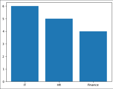
# Count Plot / Bar Chart
## `plt.bar()`
Shows category frequencies.
```python theme={null}
plt.bar(count.index, count)
plt.show()
```
### Output
Bar chart of department counts.
 ***
# Bivariate Analysis
Analyzing relationship between two variables.
***
# Scatter Plot
## `plt.scatter()`
Shows relationship between two numerical variables.
```python theme={null}
plt.scatter(df['Salary'], df['age'])
plt.show()
```
### Explanation
Each dot represents:
* X → Salary
* Y → Age
### Output
Scatter plot showing salary vs age.
***
# Bivariate Analysis
Analyzing relationship between two variables.
***
# Scatter Plot
## `plt.scatter()`
Shows relationship between two numerical variables.
```python theme={null}
plt.scatter(df['Salary'], df['age'])
plt.show()
```
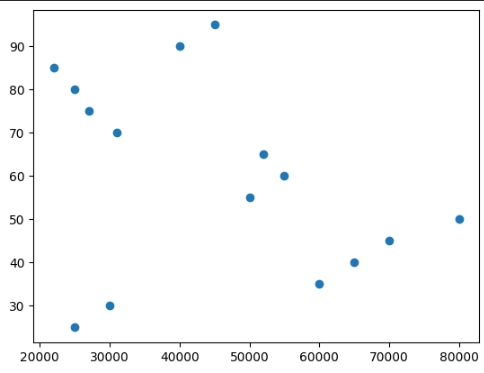
### Explanation
Each dot represents:
* X → Salary
* Y → Age
### Output
Scatter plot showing salary vs age.
 ***
# Sorted Line Plot
```python theme={null}
sort_salary = df.sort_values('Salary')
plt.plot(sort_salary['Salary'],
df['age'],
color='red',
marker='o',
linestyle=':')
plt.grid()
plt.show()
```
### Explanation
Sorting improves line continuity.
***
# Bar Chart
```python theme={null}
plt.bar(df['age'], df['Salary'], color='green')
plt.show()
```
### Explanation
Compares salary for each age.
***
# Sorted Line Plot
```python theme={null}
sort_salary = df.sort_values('Salary')
plt.plot(sort_salary['Salary'],
df['age'],
color='red',
marker='o',
linestyle=':')
plt.grid()
plt.show()
```
### Explanation
Sorting improves line continuity.
***
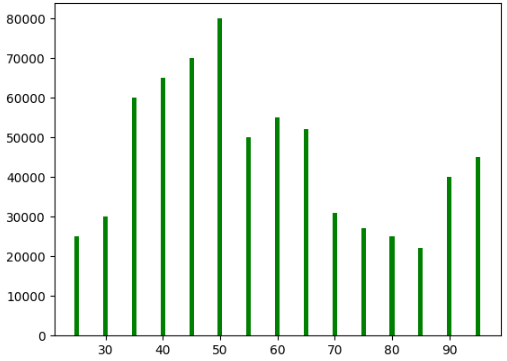
# Bar Chart
```python theme={null}
plt.bar(df['age'], df['Salary'], color='green')
plt.show()
```
### Explanation
Compares salary for each age.
 ***
# Numerical vs Categorical Analysis
***
# Multiple Boxplots
```python theme={null}
plt.boxplot([hr_sal, it_sal, finance_sal],
labels=['HR', 'IT', 'Finance'])
plt.show()
```
### Explanation
Compares salary distributions across departments.
### Output
Three side-by-side boxplots.
***
# Numerical vs Categorical Analysis
***
# Multiple Boxplots
```python theme={null}
plt.boxplot([hr_sal, it_sal, finance_sal],
labels=['HR', 'IT', 'Finance'])
plt.show()
```
### Explanation
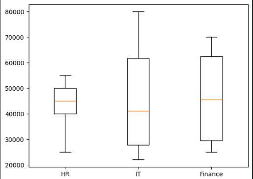
Compares salary distributions across departments.
### Output
Three side-by-side boxplots.
 ***
# Department Salary Pie Chart
```python theme={null}
salary_by_dept = df.groupby('dept')['Salary'].sum()
plt.pie(salary_by_dept,
labels=salary_by_dept.index,
autopct='%1.2f%%',
explode=[0,0.1,0],
shadow=True)
plt.axis('equal')
plt.show()
```
### Explanation
Shows total salary contribution by department.
***
# Department Salary Pie Chart
```python theme={null}
salary_by_dept = df.groupby('dept')['Salary'].sum()
plt.pie(salary_by_dept,
labels=salary_by_dept.index,
autopct='%1.2f%%',
explode=[0,0.1,0],
shadow=True)
plt.axis('equal')
plt.show()
```
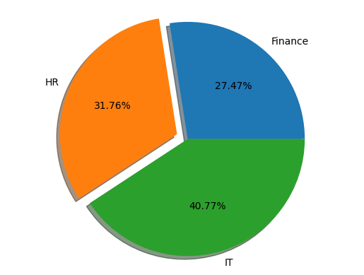
### Explanation
Shows total salary contribution by department.
 ***
# Mean Salary Bar Chart
```python theme={null}
plt.bar(['HR','IT','Finance'],
[hr_mean,it_mean,finance_mean])
plt.show()
```
### Explanation
Displays average salary per department.
***
# Mean Salary Bar Chart
```python theme={null}
plt.bar(['HR','IT','Finance'],
[hr_mean,it_mean,finance_mean])
plt.show()
```
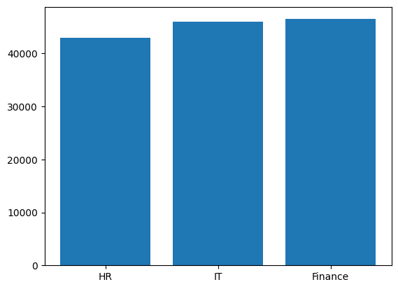
### Explanation
Displays average salary per department.
 ***
# Multivariate Analysis
Analyzing 3 or more variables.
***
# Bubble Plot
```python theme={null}
plt.scatter(df['Salary'],
df['age'],
s=df['experience']*100)
plt.title('Salary vs Age vs Experience')
plt.xlabel('Salary')
plt.ylabel('Age')
plt.show()
```
### Explanation
* X → Salary
* Y → Age
* Bubble Size → Experience
### Output
Bubble plot with varying circle sizes.
***
# Multivariate Analysis
Analyzing 3 or more variables.
***
# Bubble Plot
```python theme={null}
plt.scatter(df['Salary'],
df['age'],
s=df['experience']*100)
plt.title('Salary vs Age vs Experience')
plt.xlabel('Salary')
plt.ylabel('Age')
plt.show()
```
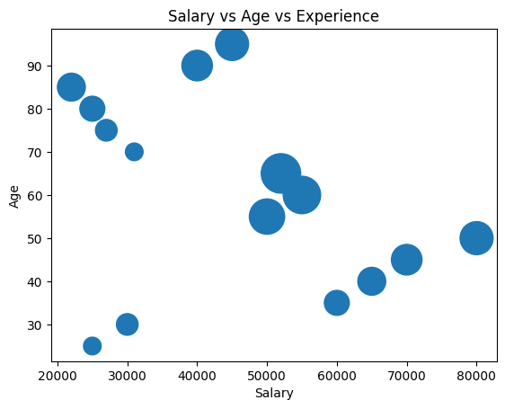
### Explanation
* X → Salary
* Y → Age
* Bubble Size → Experience
### Output
Bubble plot with varying circle sizes.
 ***
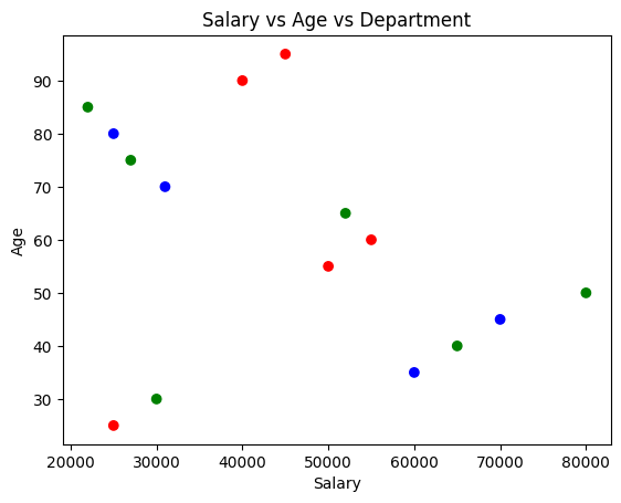
# Color-Based Scatter Plot
```python theme={null}
plt.scatter(df['Salary'],
df['age'],
c=df['dept'].map({
'HR':'red',
'IT':'green',
'Finance':'blue'
}))
plt.show()
```
### Explanation
Different colors represent departments.
***
# Color-Based Scatter Plot
```python theme={null}
plt.scatter(df['Salary'],
df['age'],
c=df['dept'].map({
'HR':'red',
'IT':'green',
'Finance':'blue'
}))
plt.show()
```
### Explanation
Different colors represent departments.
 ***
# Scatter Plot with Legend
```python theme={null}
color = {'HR':'red',
'IT':'green',
'Finance':'blue'}
for dept in color:
dept_data = df[df['dept'] == dept]
plt.scatter(dept_data['Salary'],
dept_data['age'],
label=dept,
color=color[dept])
plt.legend()
plt.show()
```
### Explanation
Adds department-wise legend.
***
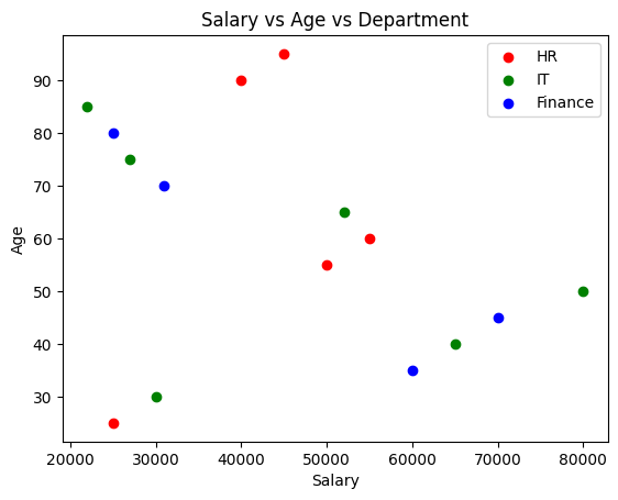
# Scatter Plot with Legend
```python theme={null}
color = {'HR':'red',
'IT':'green',
'Finance':'blue'}
for dept in color:
dept_data = df[df['dept'] == dept]
plt.scatter(dept_data['Salary'],
dept_data['age'],
label=dept,
color=color[dept])
plt.legend()
plt.show()
```
### Explanation
Adds department-wise legend.
 ***
# Object Oriented API
Provides more control over plots.
***
# `plt.subplots()`
Creates multiple plots.
```python theme={null}
fig, axs = plt.subplots(2,2, figsize=(10,10))
```
### Explanation
* 2 rows
* 2 columns
* Figure size = 10x10
***
# Object Oriented API
Provides more control over plots.
***
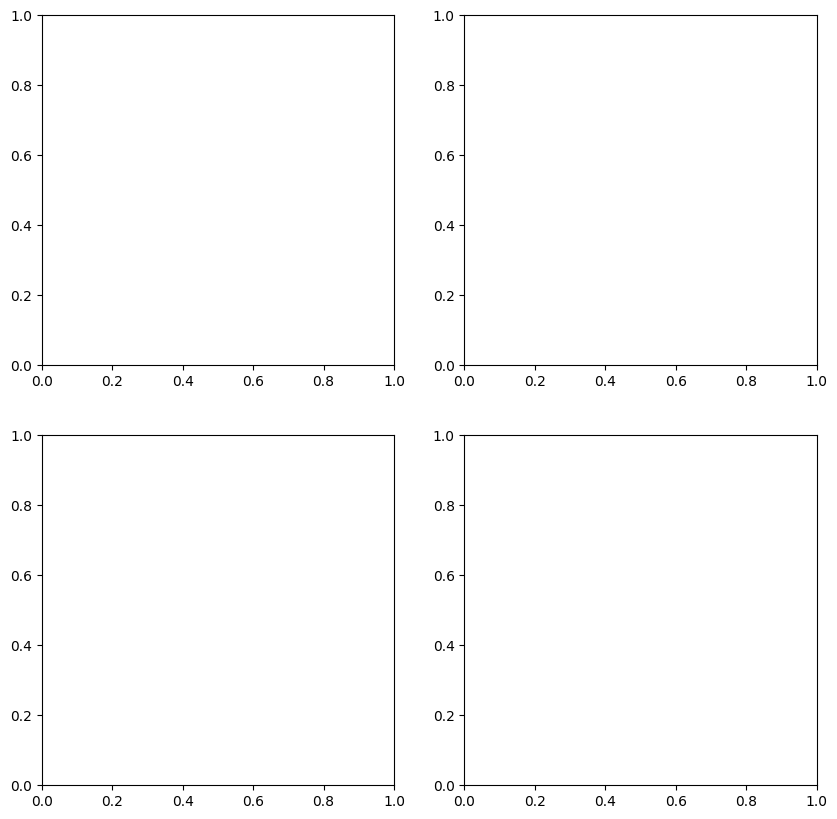
# `plt.subplots()`
Creates multiple plots.
```python theme={null}
fig, axs = plt.subplots(2,2, figsize=(10,10))
```
### Explanation
* 2 rows
* 2 columns
* Figure size = 10x10
 ***
# Multiple Plots
## Line Plot
```python theme={null}
axs[0,0].plot(df['Salary'],
color='red',
marker='o',
linestyle=':')
axs[0,0].grid()
```
***
## Histogram
```python theme={null}
axs[0,1].hist(df['Salary'],
bins=5,
color='green')
```
***
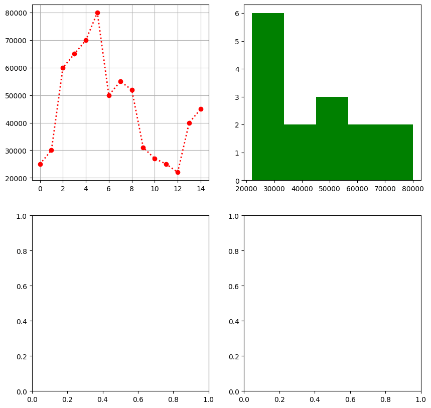
# Multiple Plots
## Line Plot
```python theme={null}
axs[0,0].plot(df['Salary'],
color='red',
marker='o',
linestyle=':')
axs[0,0].grid()
```
***
## Histogram
```python theme={null}
axs[0,1].hist(df['Salary'],
bins=5,
color='green')
```
 ***
## Boxplot
```python theme={null}
axs[1,0].boxplot(df['Salary'])
```
***
# Saving Figures
## `savefig()`
Saves plot locally.
```python theme={null}
plt.savefig('plot.png')
```
### Explanation
Saves graph as PNG image.
***
# Multiple Line Plots
```python theme={null}
plt.plot(df2['Year'], df2['Sales'], label='Sales')
plt.plot(df2['Year'], df2['Profit'], label='Profit')
plt.plot(df2['Year'], df2['Expenses'], label='Expenses')
plt.legend()
plt.show()
```
### Explanation
Displays multiple lines in same graph.
### Output
Sales, Profit, and Expenses comparison graph.
***
## Boxplot
```python theme={null}
axs[1,0].boxplot(df['Salary'])
```
***
# Saving Figures
## `savefig()`
Saves plot locally.
```python theme={null}
plt.savefig('plot.png')
```
### Explanation
Saves graph as PNG image.
***
# Multiple Line Plots
```python theme={null}
plt.plot(df2['Year'], df2['Sales'], label='Sales')
plt.plot(df2['Year'], df2['Profit'], label='Profit')
plt.plot(df2['Year'], df2['Expenses'], label='Expenses')
plt.legend()
plt.show()
```
### Explanation
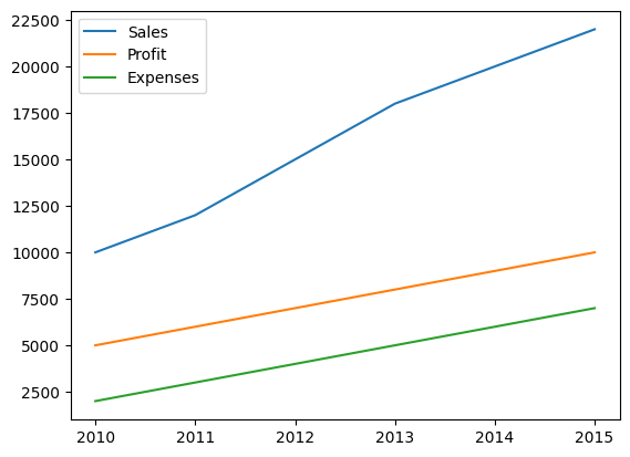
Displays multiple lines in same graph.
### Output
Sales, Profit, and Expenses comparison graph.
 ***
# 3D Plot
```python theme={null}
ax = plt.figure().add_subplot(projection='3d')
ax.scatter(df2['Year'],
df2['Sales'],
df2['Profit'])
plt.show()
```
### Explanation
Creates 3D scatter plot.
Axes:
* X → Year
* Y → Sales
* Z → Profit
***
# 3D Plot
```python theme={null}
ax = plt.figure().add_subplot(projection='3d')
ax.scatter(df2['Year'],
df2['Sales'],
df2['Profit'])
plt.show()
```
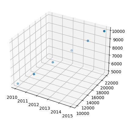
### Explanation
Creates 3D scatter plot.
Axes:
* X → Year
* Y → Sales
* Z → Profit
 ***
# Plotly 3D Plot
```python theme={null}
import plotly.express as px
fig = px.scatter_3d(df2,
x='Year',
y='Sales',
z='Profit')
fig.show()
```
### Explanation
Interactive 3D visualization using Plotly.
***
# Plotly 3D Plot
```python theme={null}
import plotly.express as px
fig = px.scatter_3d(df2,
x='Year',
y='Sales',
z='Profit')
fig.show()
```
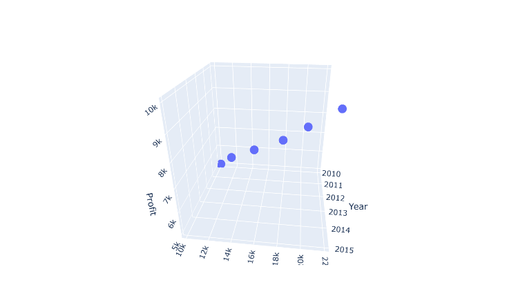
### Explanation
Interactive 3D visualization using Plotly.
 ***
# Important Plot Types Summary
| Plot Type | Used For |
| :----------- | :----------------------------- |
| Line Plot | Trends over time |
| Histogram | Frequency distribution |
| Boxplot | Outlier detection |
| Pie Chart | Percentage distribution |
| Bar Chart | Category comparison |
| Scatter Plot | Relationship between variables |
| Bubble Plot | 3-variable analysis |
| 3D Plot | Three-dimensional analysis |
***
# Important Matplotlib Functions
| Function | Purpose |
| :---------- | :------------ |
| `plot()` | Line graph |
| `hist()` | Histogram |
| `boxplot()` | Boxplot |
| `pie()` | Pie chart |
| `bar()` | Bar chart |
| `scatter()` | Scatter plot |
| `legend()` | Show legend |
| `title()` | Graph title |
| `xlabel()` | X-axis label |
| `ylabel()` | Y-axis label |
| `grid()` | Show grid |
| `show()` | Display graph |
| `savefig()` | Save figure |
***
# Matplotlib Usage
Matplotlib helps to:
* Visualize datasets
* Understand trends
* Detect outliers
* Compare categories
* Analyze relationships
* Create professional graphs
***
# Important Plot Types Summary
| Plot Type | Used For |
| :----------- | :----------------------------- |
| Line Plot | Trends over time |
| Histogram | Frequency distribution |
| Boxplot | Outlier detection |
| Pie Chart | Percentage distribution |
| Bar Chart | Category comparison |
| Scatter Plot | Relationship between variables |
| Bubble Plot | 3-variable analysis |
| 3D Plot | Three-dimensional analysis |
***
# Important Matplotlib Functions
| Function | Purpose |
| :---------- | :------------ |
| `plot()` | Line graph |
| `hist()` | Histogram |
| `boxplot()` | Boxplot |
| `pie()` | Pie chart |
| `bar()` | Bar chart |
| `scatter()` | Scatter plot |
| `legend()` | Show legend |
| `title()` | Graph title |
| `xlabel()` | X-axis label |
| `ylabel()` | Y-axis label |
| `grid()` | Show grid |
| `show()` | Display graph |
| `savefig()` | Save figure |
***
# Matplotlib Usage
Matplotlib helps to:
* Visualize datasets
* Understand trends
* Detect outliers
* Compare categories
* Analyze relationships
* Create professional graphs